Qopa22
Qopa22 typography is a commemorative work made in honor of the World Cup in 2022, and follows a sequence of projects that are developed in years of competition by Nacione™. For this edition, a rescue was made of the emotion and anxiety regarding the tournament, materializing speed and handwritten typography in a project that is defined through football.
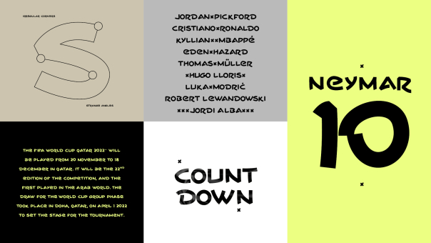
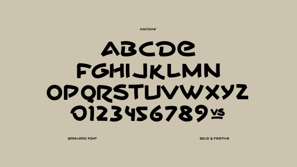
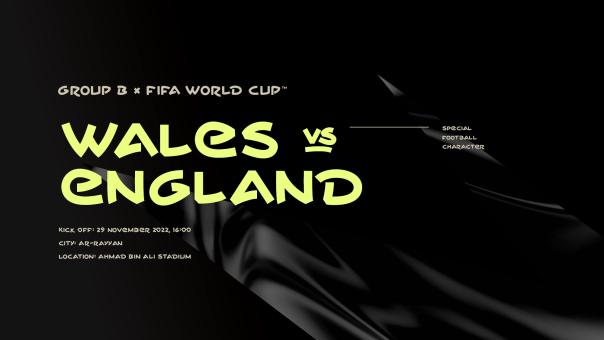
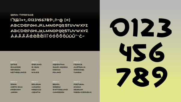
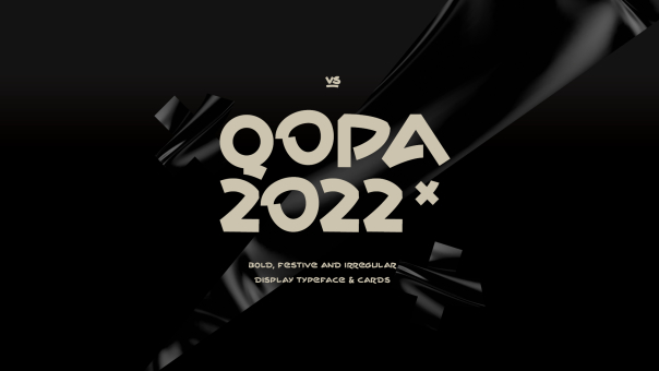
With irregular types and spacing, Qopa22 typography has a contemporary, festive language with a unique personality. The idea of honoring the wait for a World Cup came about through the tournament draw, where we filled in each space by hand with the country that had occupied the disputed position. The drawings of each type, with few differences between upper and lower case, were selected to belong to the same writing, with haste, personality and a certain elegance. Some special characters were added as the project evolved, but not all of them were developed on purpose.
The type has a single weight, functioning with the same imperfect regularity as written typography. In addition to the font, exclusive card complements created with the typographies will be available in the project to celebrate the best games and plays of the competition. Follow the other projects at www.nacione.com and on Behance: https://www.behance.net/nacione
Designer: Ricardo Carvalho
Publisher: Ricardo Carvalho
Files: TTF, OTF, EOT, WOFF, SVG
Price: 1 font / $25
 Add family to cart